0
Brand Identity
0
Side Gigs
0
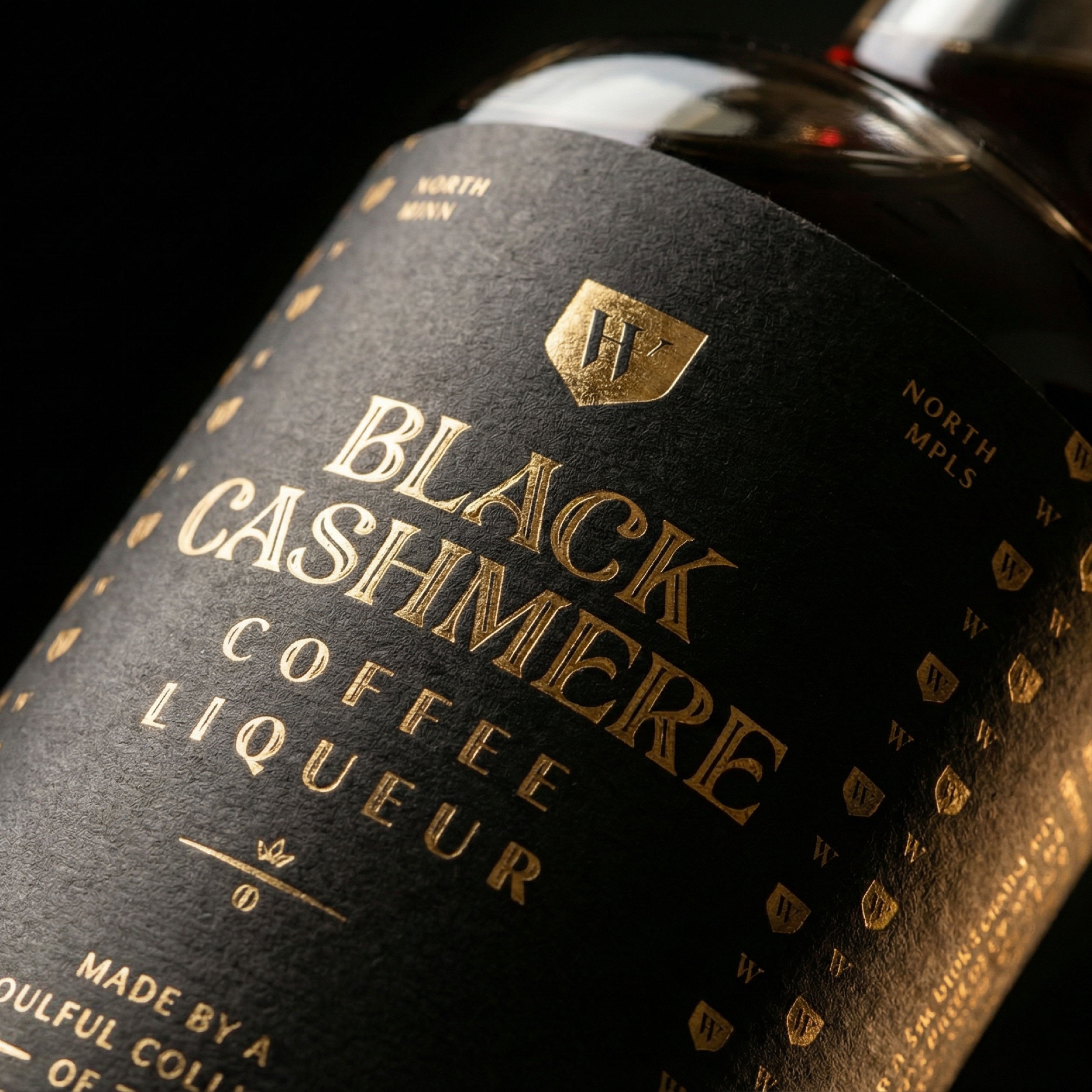
Black Cashmere

0
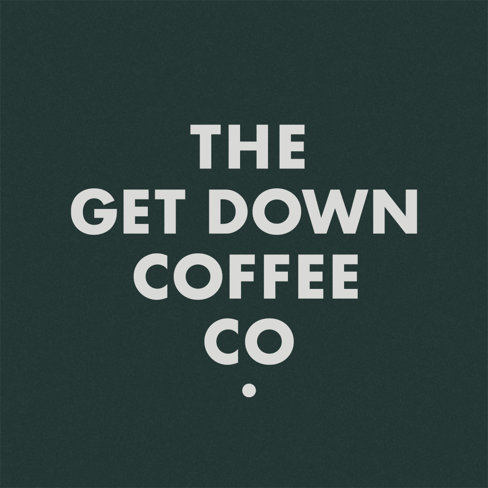
The Get Down Coffee Co.

0
Camdentown
0
Mpls St. Paul Magazine
0
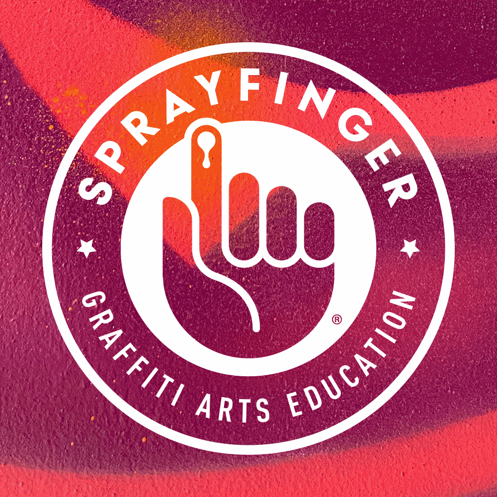
Sprayfinger
0
Houston White Brand Development

0
Afropunk Solution Sessions

0
Houston White Apparel Branding

0
Houston White for Target

0
Helyett Cycles

0
The Growler Magazine

0
Lock & Dam

0
Angie's Kettle Corn
0
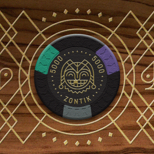
Zontik Games

0
Esquire Magazine
0
Urbis Magazine

0
Indian Motorcycle

0
Target Electronics

0
Copernicus Project
0
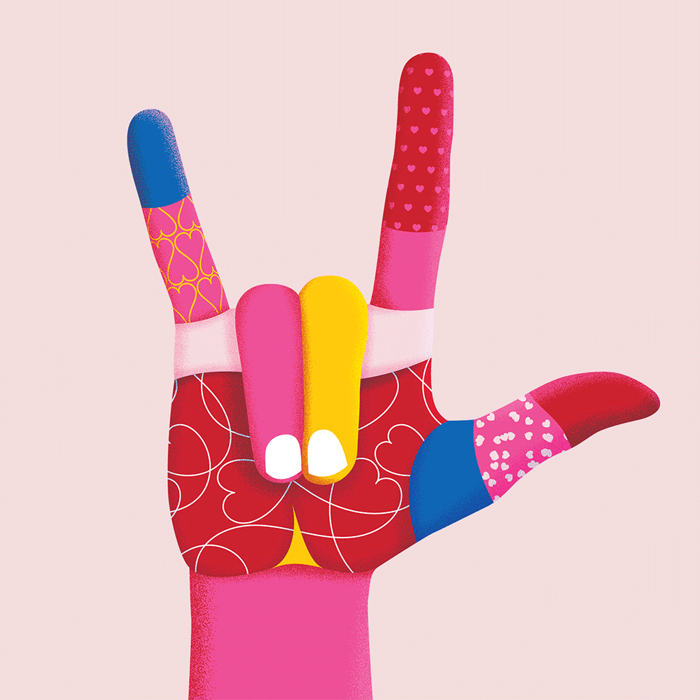
Target Valentine's Day

0
Red Bull Crashed Ice
0
Colle McVoy

0
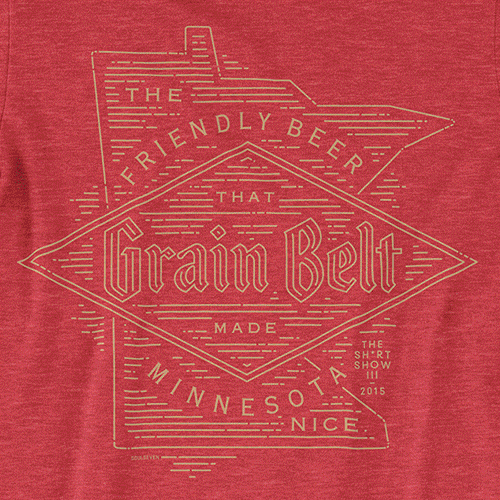
Grain Belt Beer

0
Answer Plot
0
AIGA Minnesota

0
All Set Card-Set

0
Artcrank

0
Croplan

0
ReSee

0
Lars Swanson Photography